From Legacy 1.0 to Innovation 2.0
Imagine a project with no deadline—just a vision. For over two years, I kept the team motivated and focused, turning countless iterations into meaningful innovation. The result? A service transformed through persistence and creativity.
Context of the project
Designed to streamline business processes and inter-organizational collaboration
Overview
ERP-based process management
Expense claims, Approvals, Attendance
Collaborative tools
Messaging, video calls, calendars, cloud storage
1.0 Web Service Context
With 22,400 enterprise users and no updates for over 4 years, the legacy platform needed a major overhaul.
A team had already begun planning updates a year before I joined to help drive the launch of the new version.


Role
Redesigned 1.0
→ 2.0 interface
Updated the interface of the existing 1.0 service to create the 2.0 service. Collaborated with 2 PMs, 2 content strategists, 4 engineers, and 4 product designers.
Phase 1: Layout & Prototyping
(July–Nov 2022, 5 months)
Established initial layouts and prototypes.
Brand Asset Development
(Dec 2022–June 2023, 7 months)
Designed and finalised core brand assets.
Phase 2: Refinement & Visual Details
(Oct 2023–Feb 2024, 5 months)
Focused on polishing visuals and fine details.
Design System
(Feb–July 2024, 6 months)
Built a cohesive library for scalable designs.
Progress was aligned with other system updates, resulting in interruptions based on their schedules.
The outcome
Content UI Redesign
Reduced navigation depth by 50%, improved efficiency, and prioritized key functions, cutting redundant tasks and user workload.
50% shallower navigation
Prioritised key functions
Reduced redundant tasks & workload
Deploying Visual Assets
Saved £124,000 by eliminating celebrity fees. Enhanced product launches with motion and 3D assets for consistent, high-quality branding.
Saved £124,000 on fees
Introduced motion & 3D assets
Boosted product launch visuals
Design System Update
Boosted internal productivity by 40%, modernized legacy components, and established a streamlined, updated design system through close collaboration with developers.
40% more productivity
Updated 5+ years of legacy components
Streamlined with proactive dev collaboration
Research
Based on this data, I identified issues and prioritised improvement goals.
Started with 2021 MAU data and wireframes from the predecessor.
Conducted competitive analysis and reviewed interviews with 6 users to uncover patterns for product improvement.
Decreased engagement in collaboration tools
A decline in the usage frequency of collaboration features such as messaging, web storage, contacts and calendars was observed.

Observations from the monthly active user (MAU) statistics
Expectations for frequently accessed features
The users of similar competitive products actively use frequently accessed menu functions.

The competitive analysis
Many decisions and moves frequently are required
While all necessary services for work were available, the user reported the lack of personalising information on the home screen.
Feedback from interviews with users (VOC)
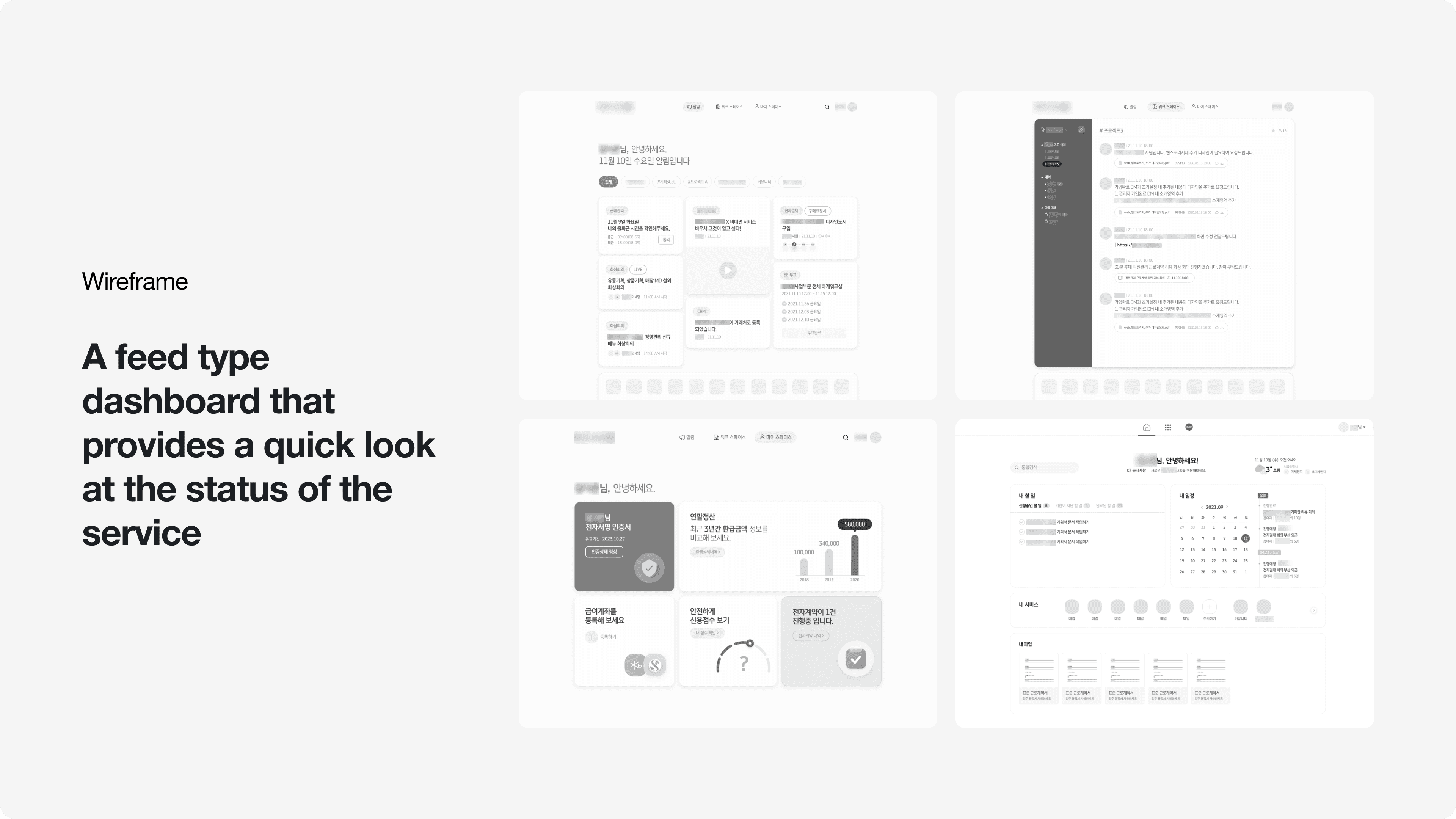
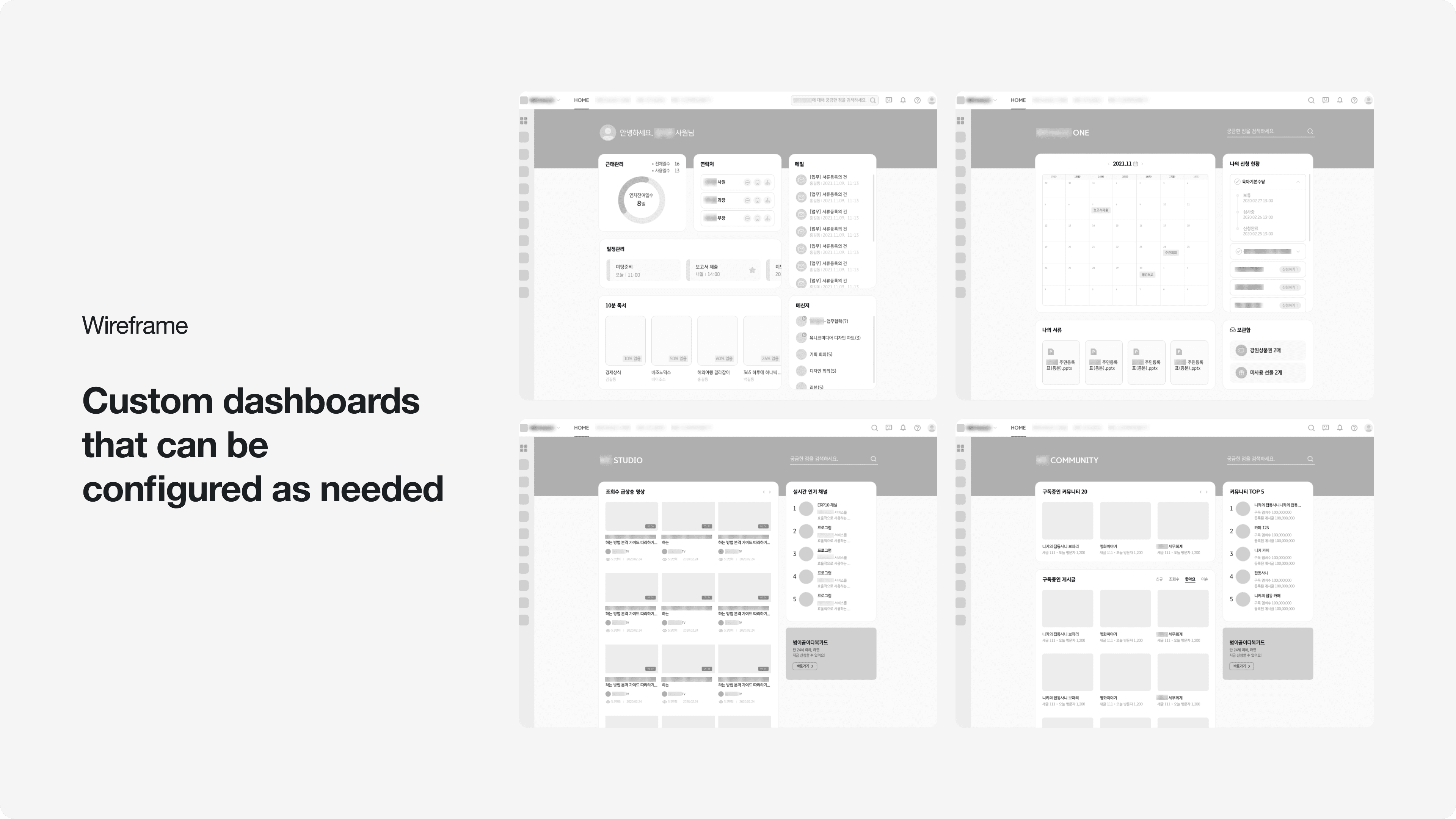
The initial wireframe
A few initial wireframes suggested customizable dashboard format to allow flexible configuration based on the user’s needs.
Findings
Users relied on a few core functions
Users mainly relied on a few work-related functions, rarely using other services.
Navigation required accessing each service individually
Navigating between services was cumbersome, with the main screen serving only as a basic portal.
Outdated visuals failed to convey brand values
The outdated visuals failed to reflect the brand’s core values, prompting the need for updates to ensure stability and trust in the new 2.0 service.
Goal
4C-Driven Design
Guided by Consistency, Continuity, Context, and Complementarity, I prioritised enhancing user satisfaction as the primary goal.
Layout Enhancement
Strengthen core functionalities and provide personalised settings to ensure users’ easy access to necessary work information.
Enhancing Content Connectivity
Improve direct access from home to frequently used functions for tasks that need to be handled in real-time.
Restoring Brand Recognition
Introduce visual assets to update existing designs and clearly communicate a professional and trustworthy brand identity.
Sorted and integrated design system
Implement an integrated design system across up to 30 products to minimise user confusion and foster positive user experiences.
Solution
How I approach solutions
Maintain layout, enhance functionality integration.
Prioritised core functionalities
Focused on strengthening service-specific content by prioritising core functionalities.
Hypothesis: Easier access improves workflow
Tested the hypothesis that easier access to version 1.0’s core features would improve usability.
Current Navigation: 3–8 screens to key features
Found that users had to navigate 3–8 screens to reach frequently used features and aimed to simplify this journey.
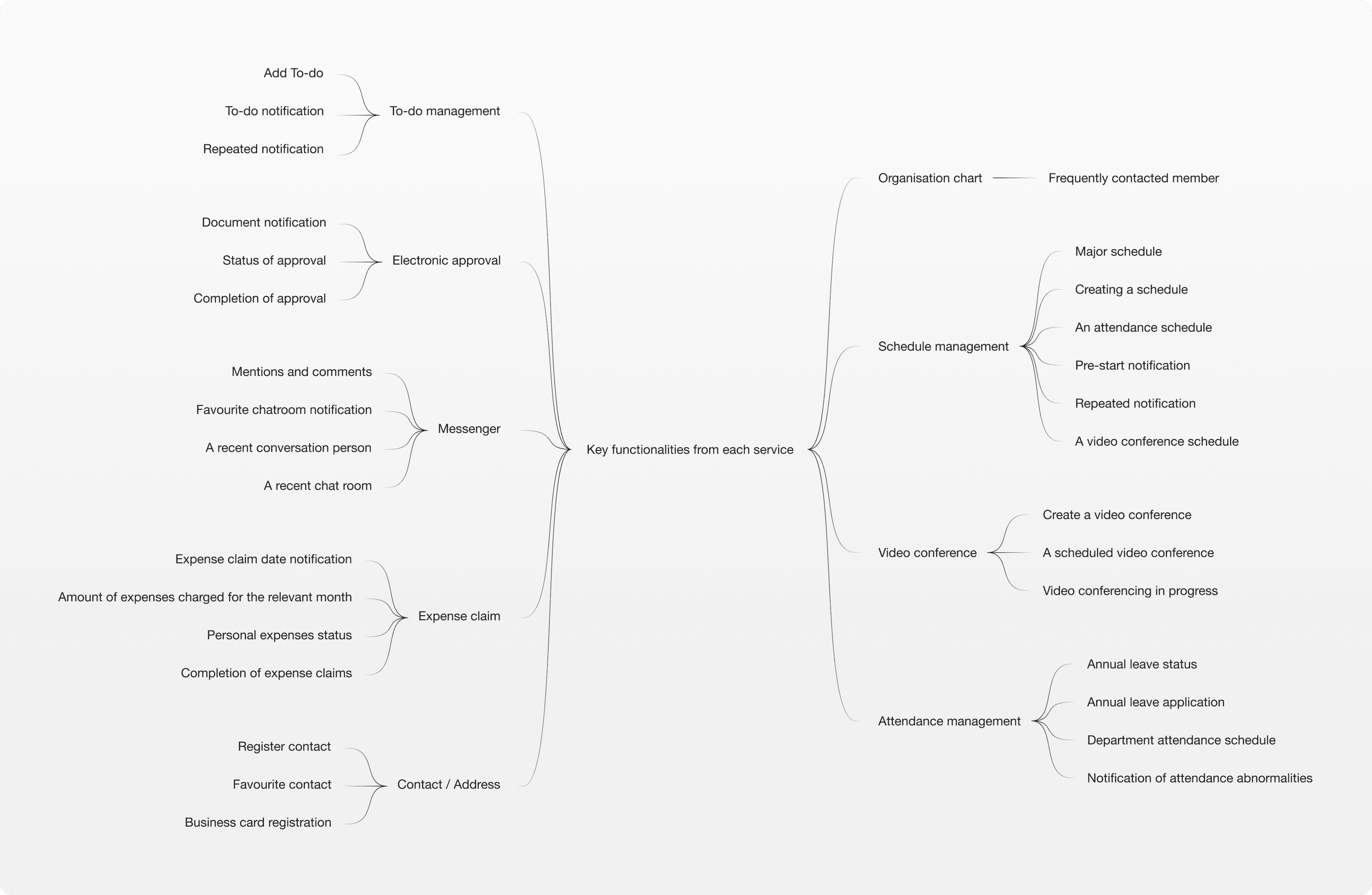
Arranging widgets
Consolidated key features from each service into a single home screen using widgets for easier access and improved usability.

Consideration of user
Long-time accountants
Accountants, long-time users of our flagship software, rely on it in an auxiliary capacity.
Avoided abrupt updates
Since the current layout meets their needs, abrupt updates could disrupt their workflow.

Feedback from interviews with users (VOC)
Focused on evolving the existing layout
Instead, we decided to refine and evolve the existing layout rather than introduce drastic changes.
The existing layout

The rearranged layout based on the 1.0 service

Enhanced widget functionality

Calendar
The calendar area has been expanded to allow users to view detailed schedules at a glance.
Schedule
Added tabs for to-do list and video meetings, with a create button for instant scheduling.
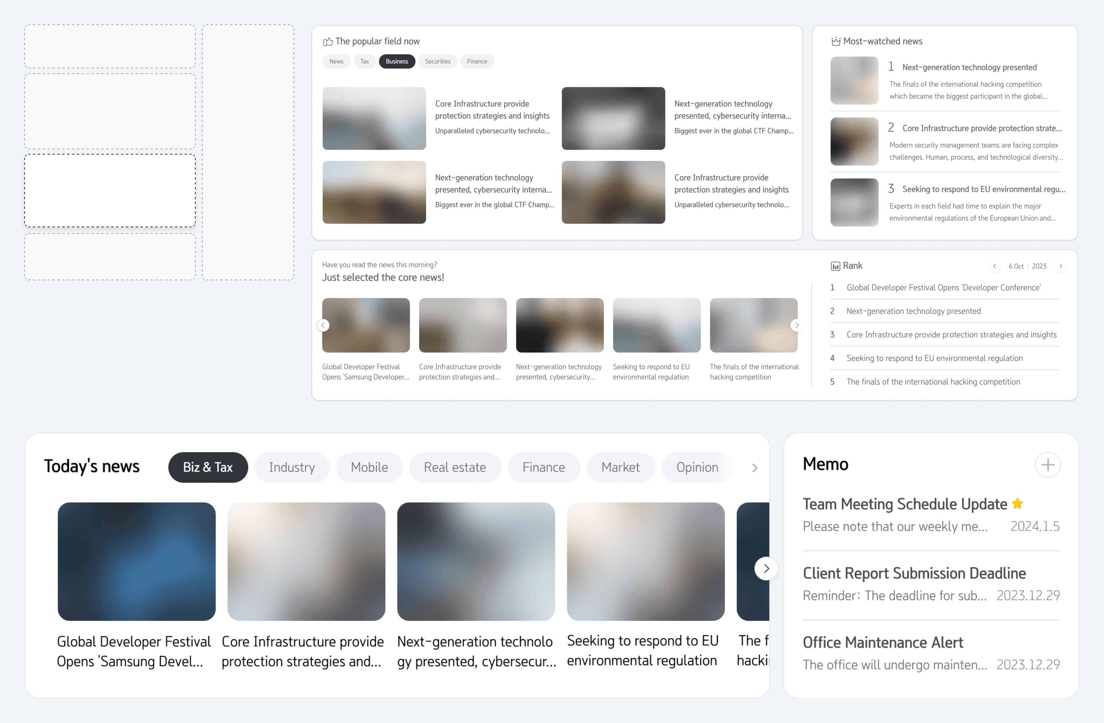
News
Redesigned thumbnail components and reduced the area to add a memo feature.
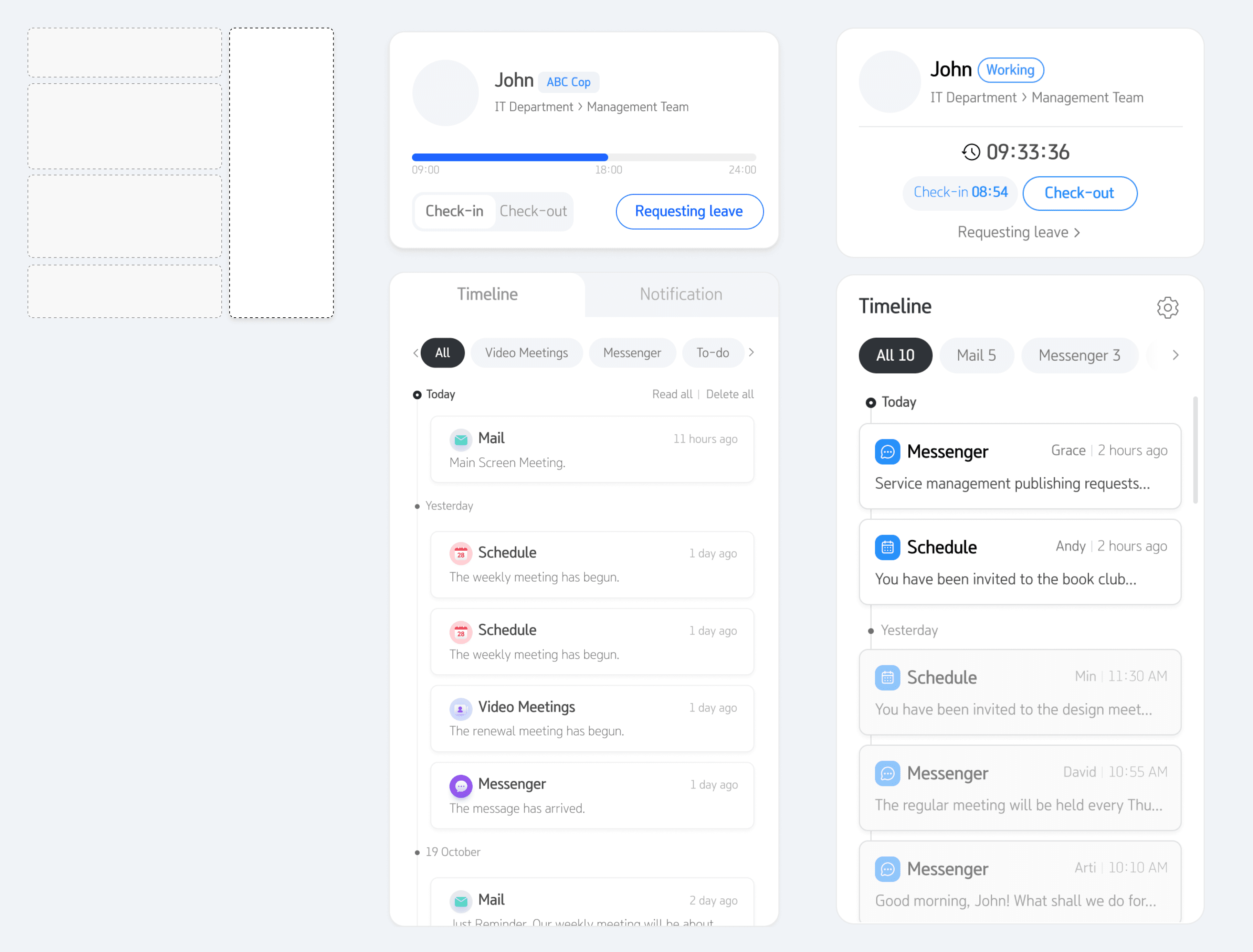
Timeline
Added sections for user attendance management and holiday requests, along with tabs to view timelines by service.
It stayed focused on the initial goal of creating a simple, standard design.
2.0's design is not visually complicated, even when it’s full of information and content.

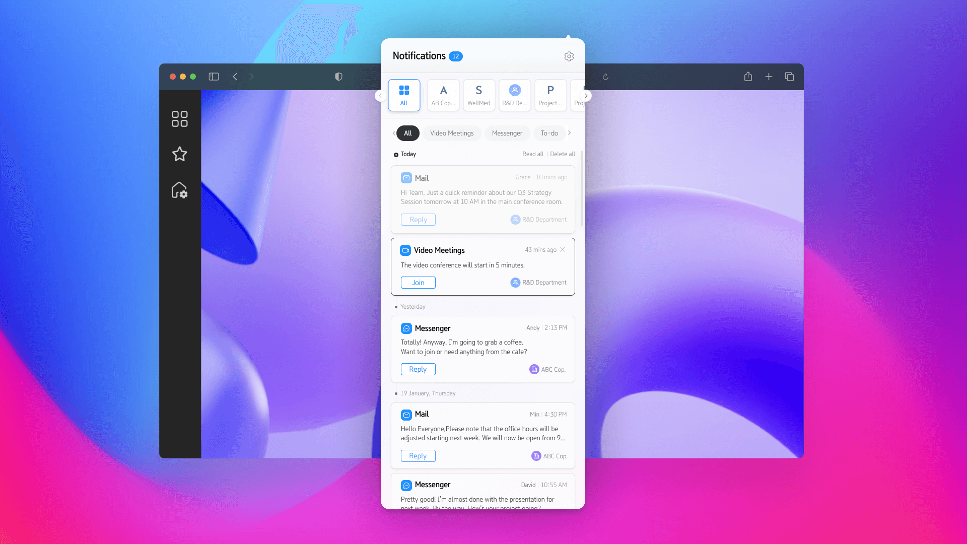
Introduction of header modal for universal access
Notifications
Allows users to check notifications specific to each service based on organisation and team.

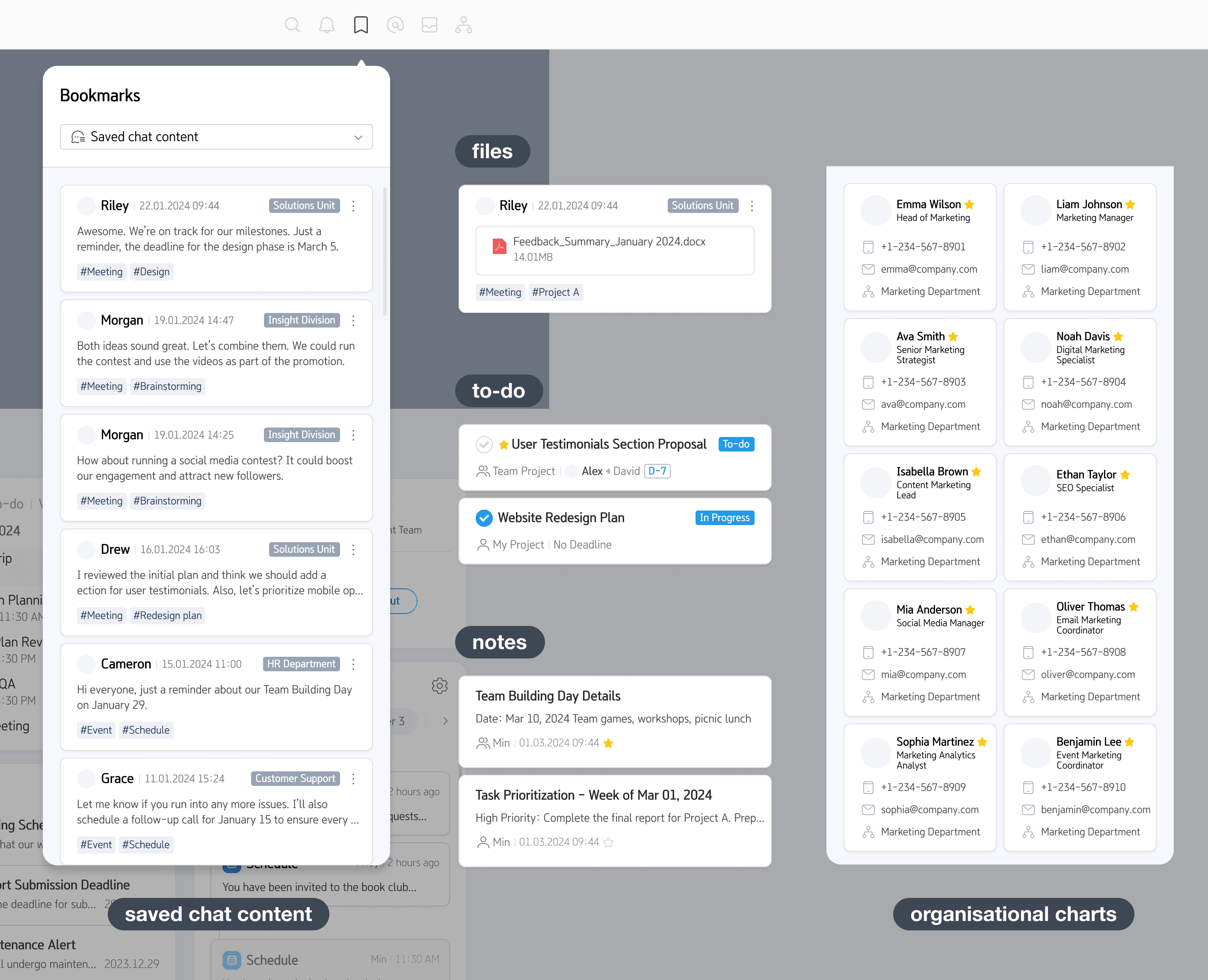
Bookmarks
Provides direct access to saved chat content, files, to-do, notes, and organisational charts.
Mentions
Displays all instances where users have been mentioned by others.

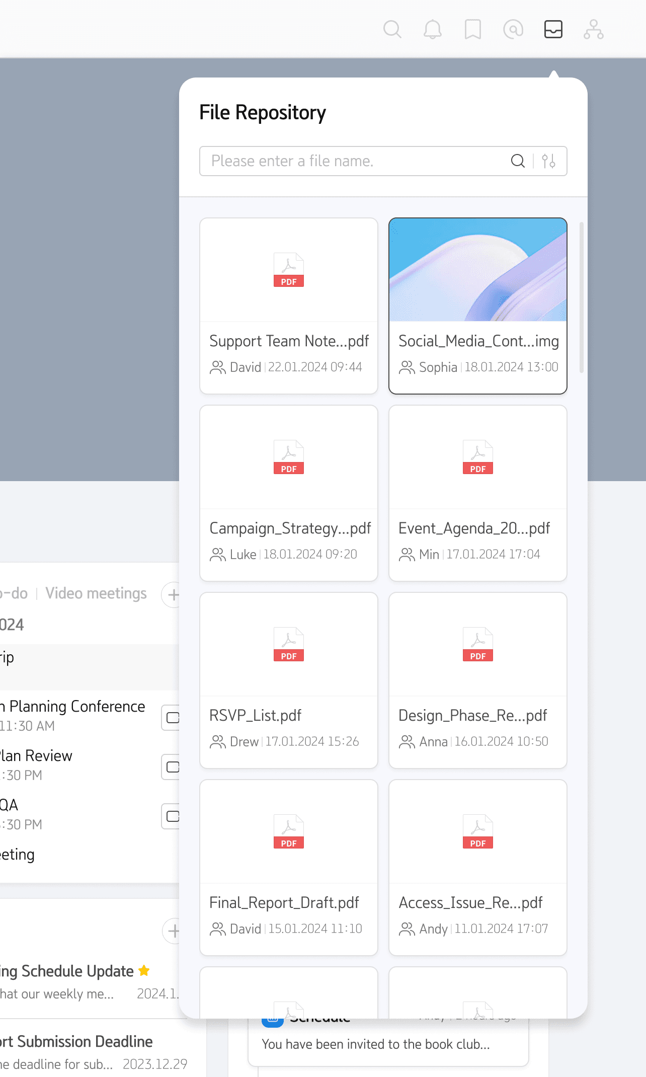
File repository
Enables filtering and searching of files exchanged in conversations.
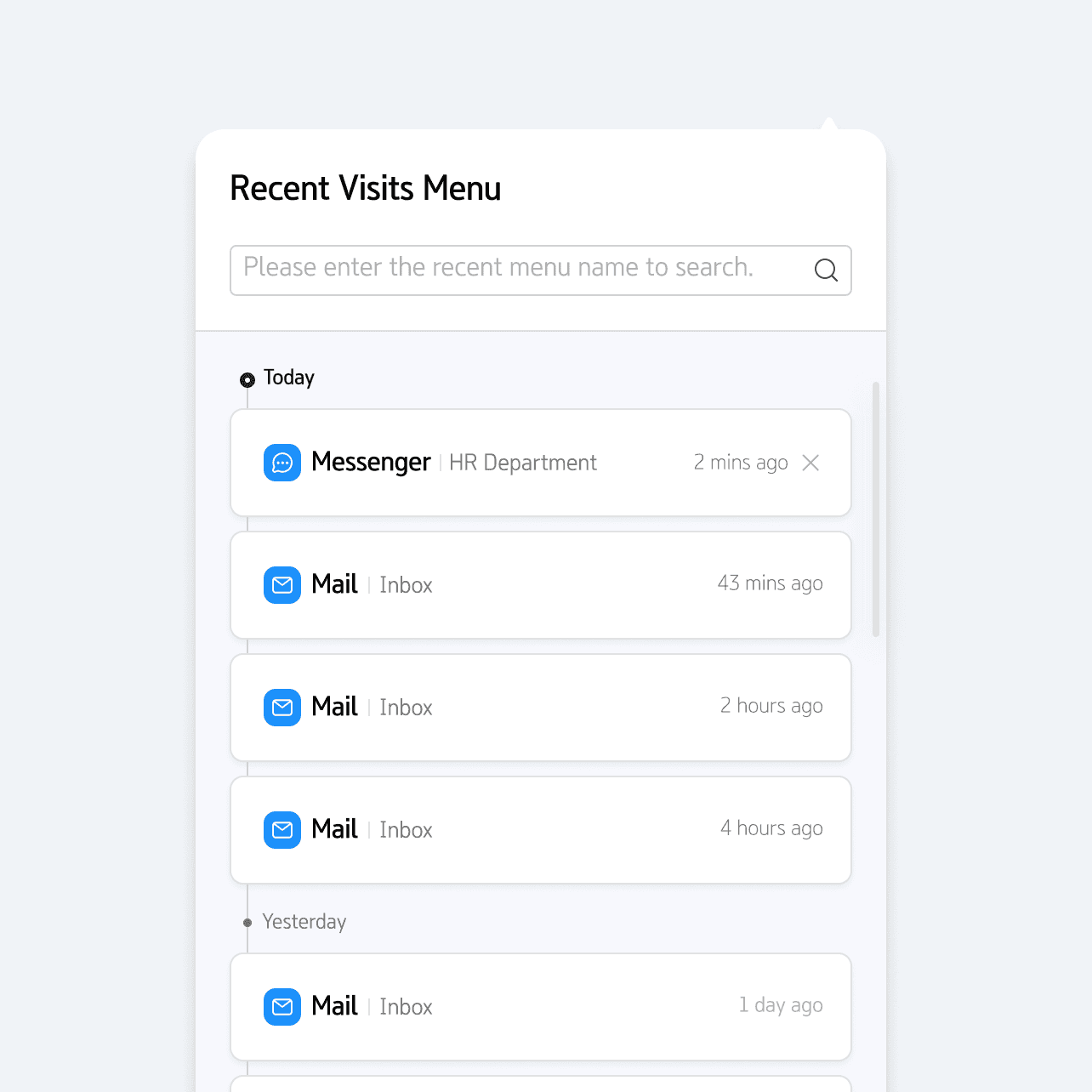
Recent visits menu
Allows users to directly access recently visited services based on their timeline.
Profile
Provides access to profile settings and guides.

Main event alerts
Highlights incoming notifications in real-time, allowing users to promptly view and respond.
Navigation simplified by 50%
Faster, more efficient user experience
Reduced navigation depth, enabling users to efficiently find what they need within just 1 to 3 levels.
View the next project