Optimising the new design system
Optimising the new design system
Optimising the new design system
Optimising the new design system
It began with the pursuit of uniformity in the shape of stars.
It began with the pursuit of uniformity in the shape of stars.

Context of the Project
Context of the Project
We tried to seek diverse designs in the process of iterating tons of drafts.
We tried to seek diverse designs in the process of iterating tons of drafts.
However, over time, we ended up creating too many copies of the basic elements such as ‘Star’ without uniformed design guidelines.
However, over time, we ended up creating too many copies of the basic elements such as ‘Star’ without uniformed design guidelines.
This led to the issue of inconsistency in service design which affected the overall service.
This led to the issue of inconsistency in service design which affected the overall service.
The outcome
The outcome
Streamlined workflows by over 40%, leading to higher productivity for internal designers through the design system.
Streamlined workflows by over 40%, leading to higher productivity for internal designers through the design system.
Streamlined workflows by over 40%, leading to higher productivity for internal designers through the design system.
With the goal of the single source of truth, optimised the design system, leading the process of standardising design systems across the company.
With the goal of the single source of truth, optimised the design system, leading the process of standardising design systems across the company.
Utilising Atomic and Anatomy design principles, rebuilt the new design system, detailing each component to suit its purpose and role.
Utilising Atomic and Anatomy design principles, rebuilt the new design system, detailing each component to suit its purpose and role.
Managed effective communication with the team and stakeholders and provided clear and easy-to-follow icon production guides.
Managed effective communication with the team and stakeholders and provided clear and easy-to-follow icon production guides.

Discover
Discover
Discover
Discover
Incompatibility and Priority issue
Incompatibility and Priority issue
Incompatibility issue
Incompatibility issue
Design guidelines before the upgrade did not include the new features.
Design guidelines before the upgrade did not include the new features.
During the previous upgrade, new components that didn't quite align with the existing design guidelines were created and used.
During the previous upgrade, new components that didn't quite align with the existing design guidelines were created and used.
Designers assumed they were using the same shape of star icon,
Designers assumed they were using the same shape of star icon,
but it was never double-checked to ensure the design compatibility.
but it was never double-checked to ensure the design compatibility.


Stars of different shapes were placed on the left and right side of the text without any rules.
Stars of different shapes were placed on the left and right side of the text without any rules.
Priority issue
Priority issue
Since the product involved multiple teams that can only communicate in online meetings settings, there were issues that we decided not to address out of courtesy to each other.
Since the product involved multiple teams that can only communicate in online meetings settings, there were issues that we decided not to address out of courtesy to each other.
Only the progress of larger projects were discussed and details and small issues have been being overlooked as they were considered low priorities.
Only the progress of larger projects were discussed and details and small issues have been being overlooked as they were considered low priorities.
After the issues involving the inconsistency of icons such as arrows and stars were identified,
After the issues involving the inconsistency of icons such as arrows and stars were identified,
I brought it up to attention in a meeting with the developers and shared my intention to solve the problem of not having a single source of truth for the current projects.
I brought it up to attention in a meeting with the developers and shared my intention to solve the problem of not having a single source of truth for the current projects.
They all agreed that this is a significant issue that needed to be addressed.
They all agreed that this is a significant issue that needed to be addressed.
Developers had noticed the discrepancy, but believed that it was the designer’s intention and built the service using them.
Developers had noticed the discrepancy, but believed that it was the designer’s intention and built the service using them.
Define
Define
Define
Define
I reset the guide criteria by identifying the part we overlooked.
I reset the guide criteria by identifying the part we overlooked.
To establish the new design system, I've set up a special channel to stay updated on design materials, share new ideas, and give each other feedback.
To establish the new design system, I've set up a special channel to stay updated on design materials, share new ideas, and give each other feedback.
I aimed to gain a practical understanding of how the components are utilised and applied in the development environment to reflect the findings on the icon guide criteria.
I aimed to gain a practical understanding of how the components are utilised and applied in the development environment to reflect the findings on the icon guide criteria.
This is a part of the discussion we had.
This is a part of the discussion we had.
“ How might we configure it in an easy-to-find browse method? ”
“ How might we configure it in
an easy-to-find browse method? ”
“ How might we configure it in
an easy-to-find browse method? ”
“ How might we configure it in
an easy-to-find browse method? ”
“ I think it would be better to group the agreed sizes. ”
“ I think it would be better
to group the agreed sizes. ”
“ I think it would be better
to group the agreed sizes. ”
“ I think it would be better
to group the agreed sizes. ”
“ And we need to categorise them by our standards. ”
“ And we need to categorise them
by our standards. ”
“ And we need to categorise them
by our standards. ”
“ And we need to categorise them
by our standards. ”
“ How might we combine it with other things? ”
“ How might we combine it
with other things? ”
“ How might we combine it
with other things? ”
“ How might we combine it
with other things? ”
“ Let's refer to our existing illustration combination type. ”
“ Let's refer to our existing
illustration combination type. ”
“ Let's refer to our existing
illustration combination type. ”
“ Let's refer to our existing
illustration combination type. ”
“ How might we standardise between area and actual icon size? ”
“ How might we standardise
between area and actual icon size? ”
“ How might we standardise
between area and actual icon size? ”
“ How might we standardise
between area and actual icon size? ”
“ I'll add a guide that serves as a reference between the area and the actual icon size. ”
“ I'll add a guide that serves as a reference
between the area and the actual icon size. ”
“ I'll add a guide that serves as a reference
between the area and the actual icon size. ”
“ I'll add a guide that serves as a reference
between the area and the actual icon size. ”
1. Even-numbered pixel,
2. One icon,
3. Categorisation
1. Even-numbered pixel,
2. One icon,
3. Categorisation
1. Even-numbered pixel,
2. One icon,
3. Categorisation
1. Even-numbered pixel,
2. One icon,
3. Categorisation
Needs to accommodate responsive web design
Needs to accommodate responsive web design
I identified discrepancies between the pixel sizes, including line thickness, and alignments of the actual icons compared to the icon grid and keylines in the existing guide.
I identified discrepancies between the pixel sizes, including line thickness, and alignments of the actual icons compared to the icon grid and keylines in the existing guide.
This problem came up because designers did not completely comprehend and follow these specifications.
This problem came up because designers did not completely comprehend and follow these specifications.
1. Even-numbered pixel,
2. One icon,
3. Categorisation
1. Even-numbered pixel,
2. One icon,
3. Categorisation
1. Even-numbered pixel,
2. One icon,
3. Categorisation
1. Even-numbered pixel,
2. One icon,
3. Categorisation
More resources are consumed with more icons
More resources are consumed with more icons
In Collaboration with the publishing team, I confirmed that there is little design difference in maintaining icons of various sizes, I have adopted the standardisation of one icon size and defined clear naming conventions for easy differentiation and management for engineering benefits.
In Collaboration with the publishing team, I confirmed that there is little design difference in maintaining icons of various sizes, I have adopted the standardisation of one icon size and defined clear naming conventions for easy differentiation and management for engineering benefits.
1. Even-numbered pixel,
2. One icon,
3. Categorisation
1. Even-numbered pixel,
2. One icon,
3. Categorisation
1. Even-numbered pixel,
2. One icon,
3. Categorisation
1. Even-numbered pixel,
2. One icon,
3. Categorisation
To achieve 'single source of truth' and easier management
To achieve 'single source of truth' and easier management
I categorised all icons based on analysing their functionalities, scope covered by the service, usage frequency, and characteristics.
I categorised all icons based on analysing their functionalities, scope covered by the service, usage frequency, and characteristics.
Develop
Develop
Develop
Develop
Iconography Production Guide
Iconography Production Guide
10x scale factor was applied, the designers were asked to refer to the specified size when making icons.
10x scale factor was applied, the designers were asked to refer to the specified size when making icons.
Grid & Key Lines
Grid & Key Lines
Icons are created on a 24-unit grid and can be adjusted to 18 / 14 / 12 grid areas if needed.
Icons are created on a 24-unit grid and can be adjusted to 18 / 14 / 12 grid areas if needed.
➊ Padding
➊ Padding
‣
Icons are placed in the area within the grid, excluding the padding area.
Icons are placed in the area within the grid, excluding the padding area.
➋ Live area (content)
➋ Live area (content)
‣
The area where icons are placed within the grid.
The area where icons are placed within the grid.
➌ Key lines (content)
➌ Key lines (content)
‣
Icons are designed referencing Key line Shapes to maintain consistent visual proportions.
Icons are designed referencing Key line Shapes to maintain consistent visual proportions.

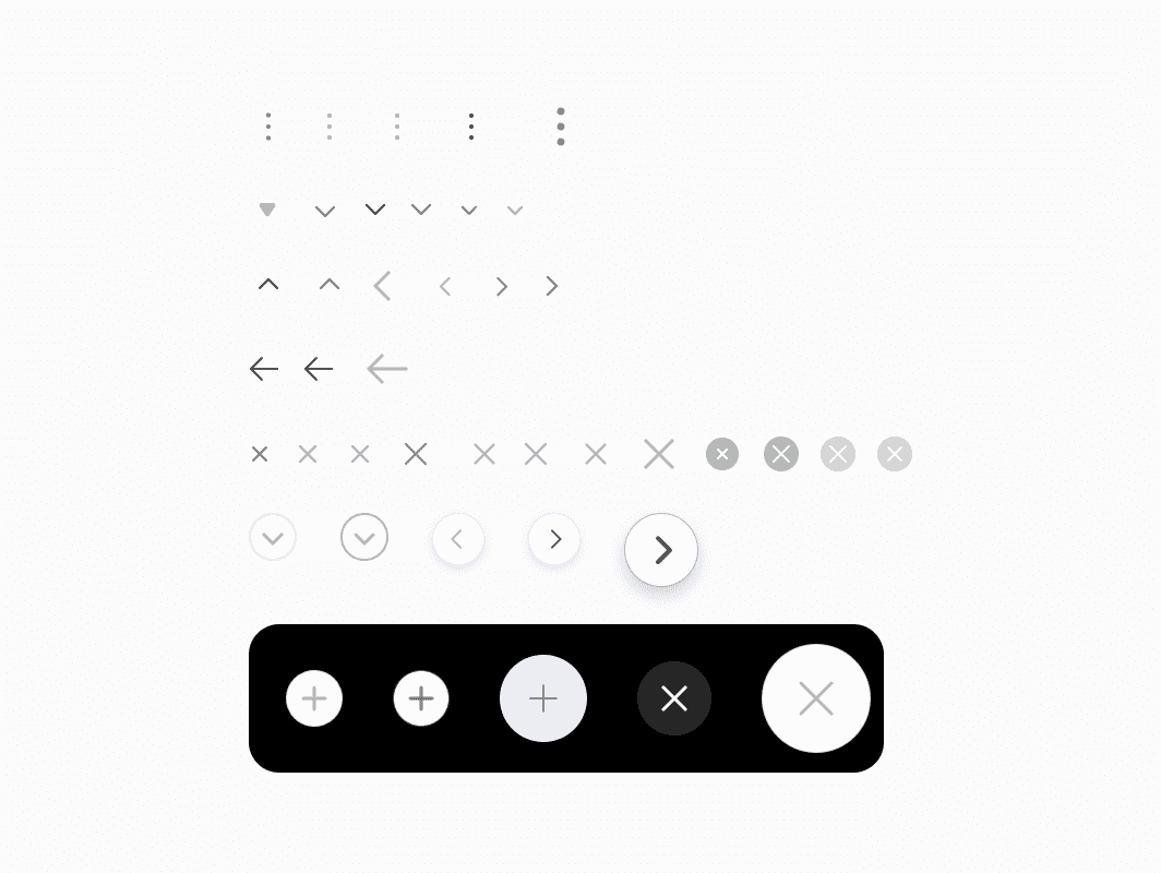
Alignment
Alignment
Icons placed within the grid area are aligned according to Key lines.
Icons placed within the grid area are aligned according to Key lines.
➊ Icon Alignment
➊ Icon Alignment
‣
Align the outline of the icon to stay within Key lines.
Align the outline of the icon to stay within Key lines.
➋ Points Placement
➋ Points Placement
‣
When the stroke weight is 1.5 pixels, there may be cases including decimal points 0.25 or 0.75.
When the stroke weight is 1.5 pixels, there may be cases including decimal points 0.25 or 0.75.
➌ Stroke Alignment
➌ Stroke Alignment
‣
Set the stroke alignment option to Center.
Set the stroke alignment option to Center.
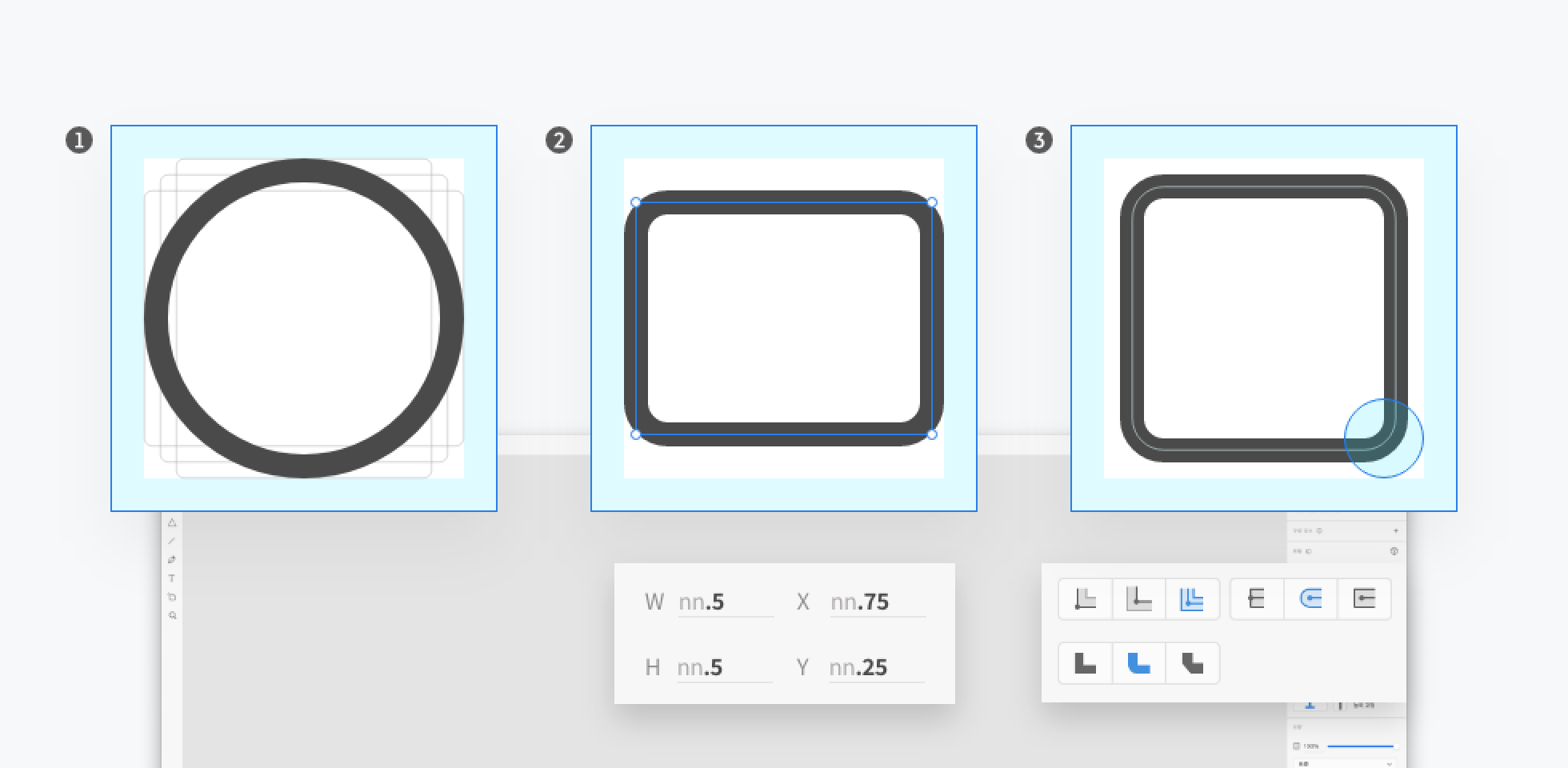
Stroke
Stroke
Icons created based on 24 units are used by converting them into outlines.
Icons created based on 24 units are used by converting them into outlines.
➊ Stroke Weight
➊ Stroke Weight
‣
Apply a stroke weight of 1.5 pixels.
Apply a stroke weight of 1.5 pixels.
➋ Stroke Radius
➋ Stroke Radius
‣
Apply a corner radius of 2 pixels based on Key line Shapes. Adjust as needed.
Apply a corner radius of 2 pixels based on Key line Shapes. Adjust as needed.
➌ Outline Strokes
➌ Outline Strokes
‣
Use the final icon as a single vector by converting it to outline / add / transform to path. The size of the icon’s outline vector should be even-numbered pixel.
Use the final icon as a single vector by converting it to outline / add / transform to path. The size of the icon’s outline vector should be even-numbered pixel.

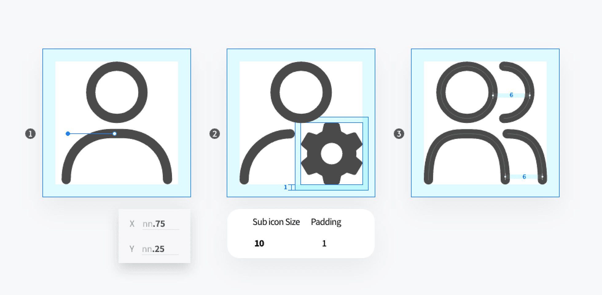
Sub Icons
Sub Icons
Icons placed within the grid area are aligned according to Key lines.
Icons placed within the grid area are aligned according to Key lines.
➊ Points Handle
➊ Points Handle
‣
Positions of handles used on curves may include decimal points 0.25 or 0.75.
Positions of handles used on curves may include decimal points 0.25 or 0.75.
➋ Sub Icons Padding
➋ Sub Icons Padding
‣
Combine icons are placed in the grid, excluding the padding area.
Combine icons are placed in the grid, excluding the padding area.
➌ Main Shape / Outer Shape
➌ Main Shape / Outer Shape
‣
When combining icons similar to the main icon shape, place them within the Live area based on even spacing.
When combining icons similar to the main icon shape, place them within the Live area based on even spacing.
Naming
Naming
Add styles to the library components based on the icon shape.
Add styles to the library components based on the icon shape.
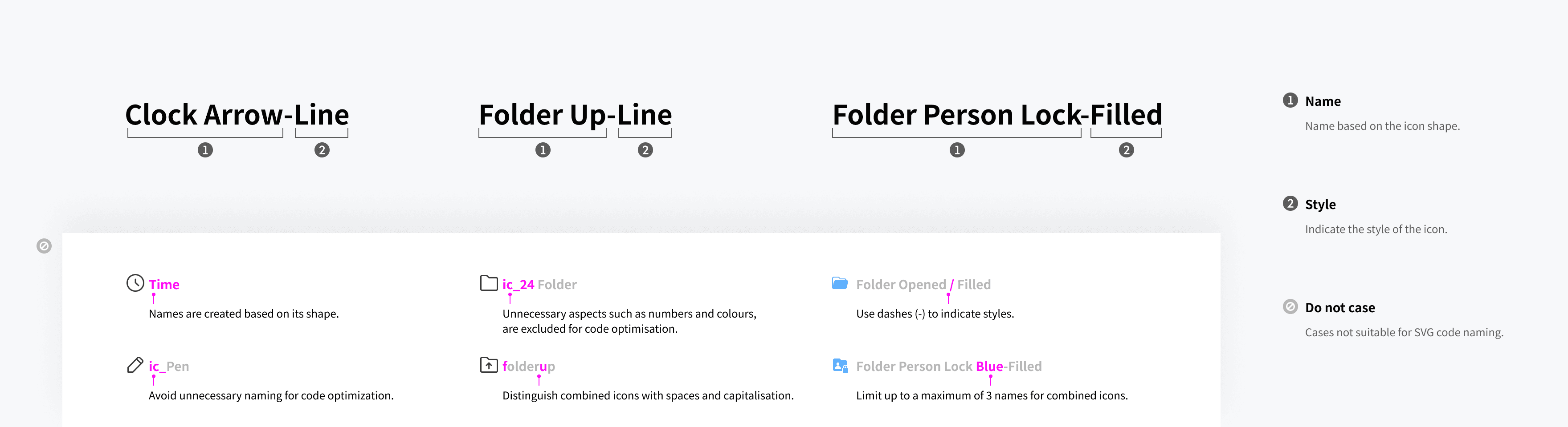
Categorising
Categorising
Categories the icons by function and manages them on one artboard.
Categories the icons by function and manages them on one artboard.

Deliver
Deliver
Deliver
Deliver
I constructed the design system based on Atomic Design and Anatomy principles.
I constructed the design system based on Atomic Design and Anatomy principles.
Icons were classified into two roles:
Icons were classified into two roles:
➊ Leading Icon
➊ Leading Icon
Icons symbolising the meaning of text.
Icons symbolising the meaning of text.
‣
➋ Trailing Icon
➋ Trailing Icon
‣
Icons representing the functionality
Icons representing the functionality
Categorised their scope of influence into three areas
Categorised their scope of influence into three areas
Layout Area > Content Area > Component
Layout Area > Content Area > Component
➊ Layout Area
➊ Layout Area
‣
Influences all areas within the screen.
Influences all areas within the screen.
➋ Content Area
➋ Content Area
‣
Only affects the content area without impacting information in higher areas.
Only affects the content area without impacting information in higher areas.
➌ Component
➌ Component
‣
Only affects the component area without influencing information in higher areas.
Only affects the component area without influencing information in higher areas.

Early in the project, I gathered all duplicated components in one place to assess their current status. I categorised components that require updates among those generally used.
Early in the project, I gathered all duplicated components in one place to assess their current status. I categorised components that require updates among those generally used.
This allowed the team to list the components that needed to be created and clearly define their functions and usage.
This allowed the team to list the components that needed to be created and clearly define their functions and usage.
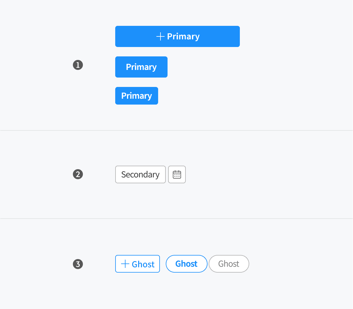
Button
Button
I redefined the hierarchy of buttons to distinctly differentiate primary, secondary, and ghost buttons. also introduced new types of buttons such as icon buttons and fixed buttons.
I redefined the hierarchy of buttons to distinctly differentiate primary, secondary, and ghost buttons. also introduced new types of buttons such as icon buttons and fixed buttons.
Overview
Overview
➊ Default button
➊ Default button
➋ Top fixed button
➋ Top fixed button
➌ Action button
➌ Action button
➍ Text button
➍ Text button

Hierarchy
Hierarchy
➊ Primary button
➊ Primary button
➋ Secondary button
➋ Secondary button
➌ Ghost button
➌ Ghost button
Anatomy
Anatomy
➊ Button container
➊ Button container
➋ Leading icon
➋ Leading icon
➌ Text area
➌ Text area

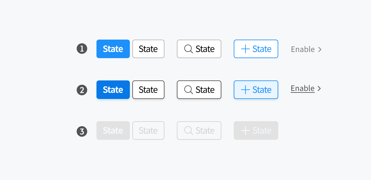
State
State
➊ Enabled
➊ Enabled
➋ Hovered
➋ Hovered
➌ Disabled
➌ Disabled
Chip
Chip
Chips were designed to handle various cases including deletion, emojis, and icons.
Chips were designed to handle various cases including deletion, emojis, and icons.
Overview
Overview
➊ Filter chip
➊ Filter chip
➋ Input chip
➋ Input chip
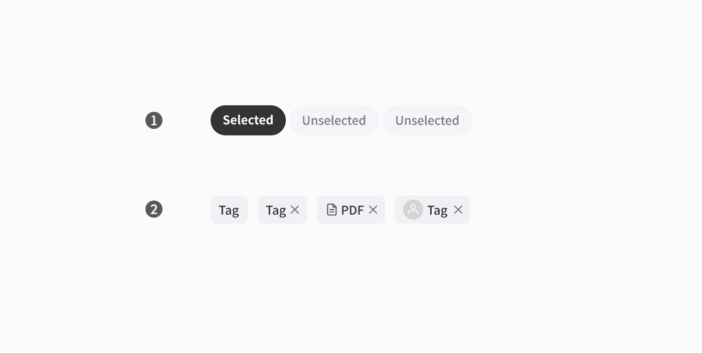
Anatomy
Anatomy
➊ Container
➊ Container
➋ Text
➋ Text
➌ Image area (optional)
➌ Image area (optional)
➍ Icon (optional)
➍ Icon (optional)
Variants
Variants
➊ Small
➊ Small
➋ Medium
➋ Medium
➌ Large
➌ Large

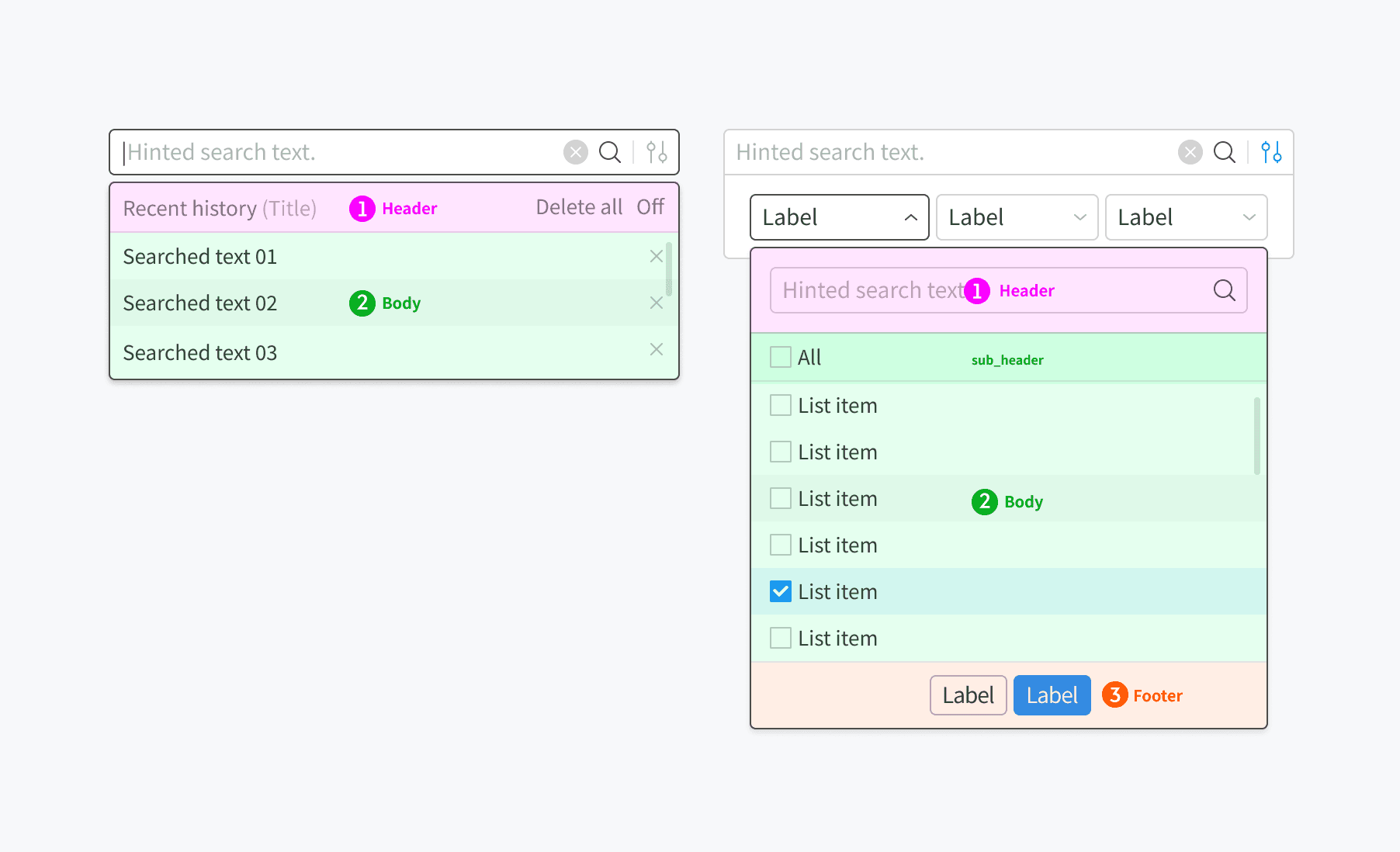
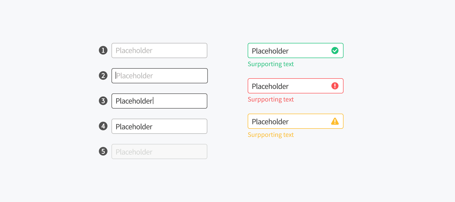
Input
Input
Based on input anatomy, we defined containers, placeholders, and icon areas.
For search fields, I designed them considering basic, wide area, and filter cases.
Additionally, I created Header, Body, and Footer in an Atomic structure to facilitate user interaction.
Based on input anatomy, we defined containers, placeholders, and icon areas.
For search fields, I designed them considering basic, wide area, and filter cases.
Additionally, I created Header, Body, and Footer in an Atomic structure to facilitate user interaction.
Anatomy
Anatomy
➊ Container
➊ Container
➋ Placeholder
➋ Placeholder
➌ Icon area
➌ Icon area

➊ Container
➊ Container
➋ Leading icon
➋ Leading icon
➌ Trailing icon
➌ Trailing icon

➊ Header
➊ Header
➋ Body
➋ Body
➌ Footer
➌ Footer
State
State
➊ Enabled
➊ Enabled
➋ Focused
➋ Focused
➌ Typing
➌ Typing
➍ Focused out
➍ Focused out
➎ Disabled
➎ Disabled
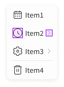
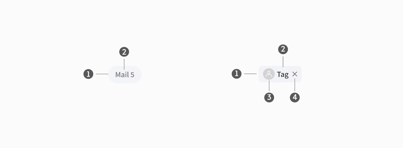
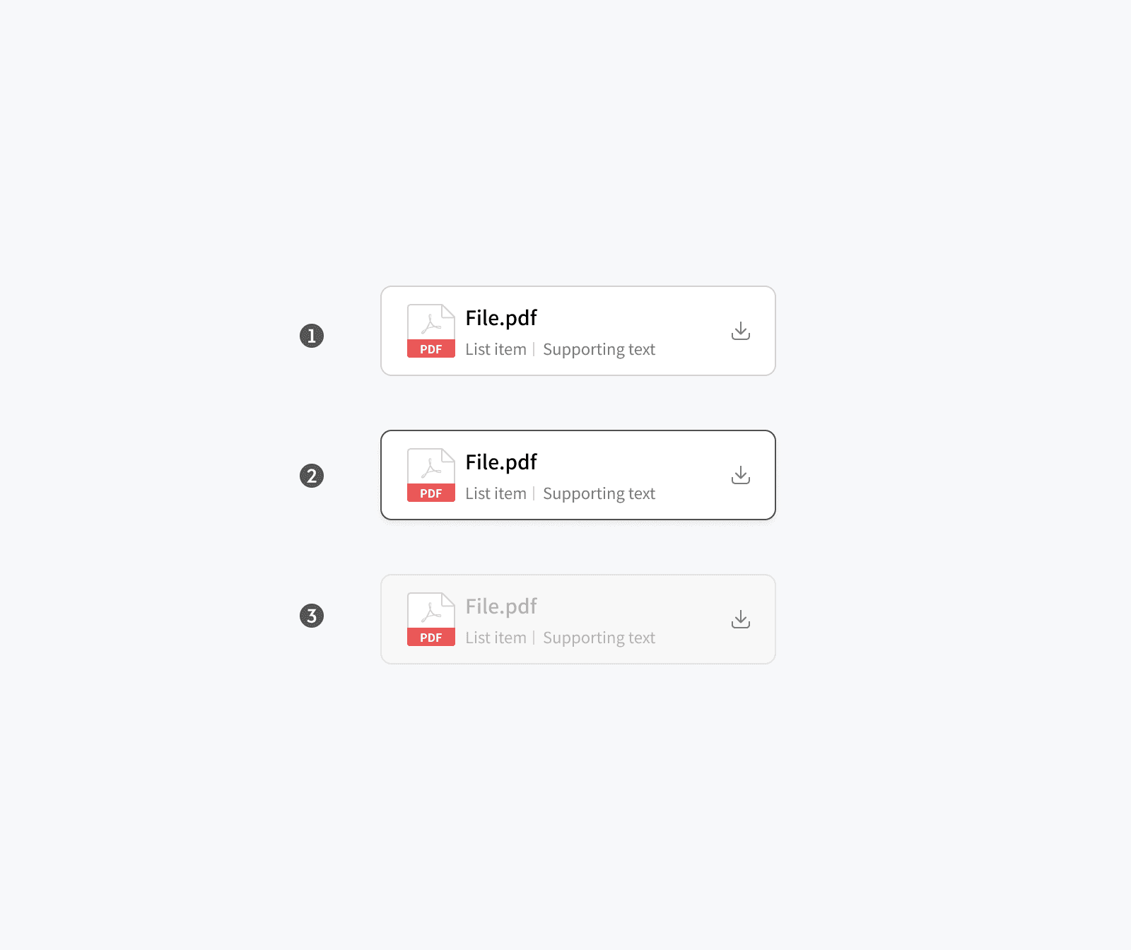
List
List
The List component, capable of vertical composition, was designed with containers, left area, text area, and right area. It was designed to accommodate various types such as Profile, File, Service, and Icons.
The List component, capable of vertical composition, was designed with containers, left area, text area, and right area. It was designed to accommodate various types such as Profile, File, Service, and Icons.
Anatomy
Anatomy
➊ Container
➊ Container
➋ Left area
➋ Left area
➌ Text area
➌ Text area
➍ Right area
➍ Right area

Type
Type
➊ One-line list
➊ One-line list
➋ Two-line list
➋ Two-line list

State
State
➊ Default
➊ Default
➋ Hovered
➋ Hovered
➌ Disabled
➌ Disabled
Card
Card
The Card component, capable of horizontal composition, defined structures including container, headline, body text, and content area to effectively convey diverse information.
The Card component, capable of horizontal composition, defined structures including container, headline, body text, and content area to effectively convey diverse information.
Anatomy
Anatomy
➊ Container
➊ Container
➋ Headline
➋ Headline
➌ Body text
➌ Body text
➍ Content area
➍ Content area

Type
Type
➊ One-line card
➊ One-line card
➋ Two-line card
➋ Two-line card
➌ Three-line card
➌ Three-line card
➍ Preview card
➍ Preview card
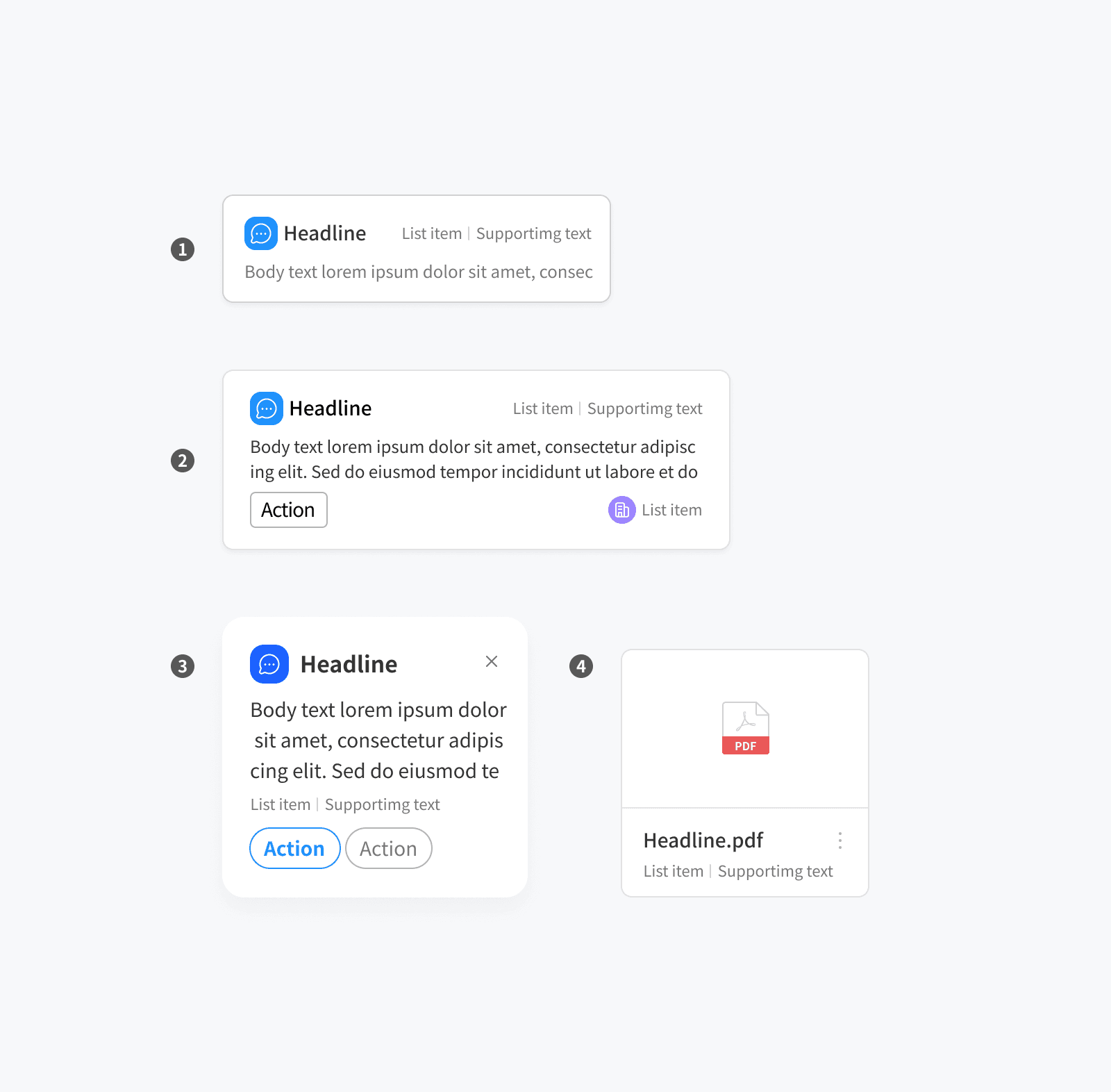
State
State
➊ Default
➊ Default
➋ Hovered
➋ Hovered
➌ Disabled
➌ Disabled

Table
Table
For Tables, I devised compromise solutions to avoid overlapping box areas:
For Tables, I devised compromise solutions to avoid overlapping box areas:
Maintaining the design of the existing table.
Maintaining the design of the existing table.
Utilising the area as much as possible to accommodate more information.
Utilising the area as much as possible to accommodate more information.
Popup
In response to user feedback on large pop-ups causing inconvenience in laptop environments, similar to table structures, I improved them to maximise space utilisation.
In response to user feedback on large pop-ups causing inconvenience in laptop environments, similar to table structures, I improved them to maximise space utilisation.


What I Learned from the Project
What I Learned from the Project
What I Learned from the Project
What I Learned from the Project
Ultimately, throughout the extensive process of this massive project, I learned how to understand each other's perspectives and effectively collaborate to find solutions.
Ultimately, throughout the extensive process of this massive project, I learned how to understand each other's perspectives and effectively collaborate to find solutions.
Getting the approval for the launch of this massive product was one of the most crucial moments for our team, considering the challenges and issues we have dealt with for years.
Getting the approval for the launch of this massive product was one of the most crucial moments for our team, considering the challenges and issues we have dealt with for years.
I learned how to lead iterative improvements throughout the end-to-end of the project.
I learned how to lead iterative improvements throughout the end-to-end of the project.
As part of this, I significantly contributed to cost savings in advertising through improvements in brand assets and collaborated closely with developers to establish a design system, which greatly enhanced our service quality and development efficiency.
As part of this, I significantly contributed to cost savings in advertising through improvements in brand assets and collaborated closely with developers to establish a design system, which greatly enhanced our service quality and development efficiency.